One way to transpose images from one sheet to another without using a computer is the Grid Method. For this to work, you only need three things: a pencil, a ruler, and an image.
Steps
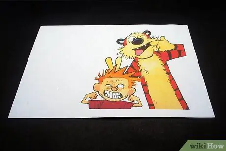
Step 1. Choose an image
For this example we will use a take a cartoon by Calvin and Hobbes.
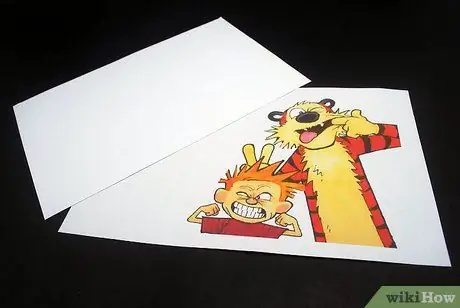
Step 2. Choose your drawing pad
It should be scaled to the size of the original drawing.
- For example, if you have a 21.4 x 28cm image, then scale the paper proportionally (e.g. 43 x 56cm - double, or 10.7 x 14cm - half). In this article, we will make a 1: 1 scale drawing (21.4 x 28cm) to compare them side by side.
- In the photo, you can see the two 21.4 x 28cm sheets. The top is your reference, the bottom is your drawing pad.
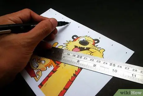
Step 3. Mark the edges of the reference drawing at regular intervals
In this guide, you'll be using 2.5cm intervals. The final result will be to obtain reference marks evenly spaced from each other along the edge of your paper.
If you used the suggested distance, you will end up with a 1.27 cm mark in the top or bottom half of the design, because the length (or height, when flipped as in the example) is only 21.4 cm
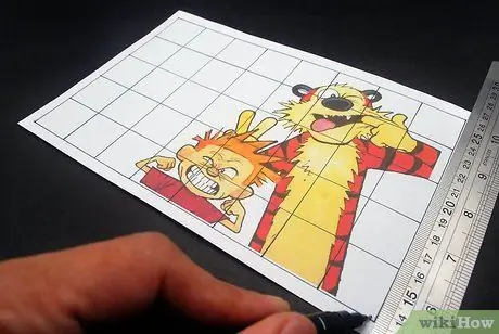
Step 4. Join the opposite signs with the ruler
The lines will form a grid pattern, hence the name "Grid Method".
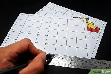
Step 5. Make exactly the same grid pattern on your drawing pad
You will eventually get something similar to the image provided.
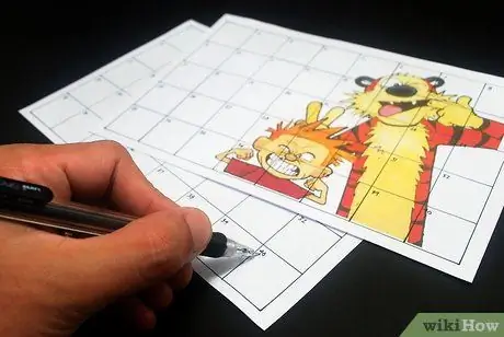
Step 6. Once the grid is complete, number each box on both sheets, starting in the upper left corner
If you did it right, you should have 40 separate panes. The result should resemble a long calendar.
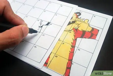
Step 7. Now it's time to start drawing
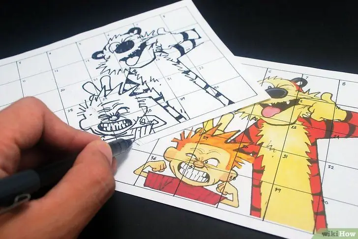
Start where you like. In the illustration in the example, you can see the draftsman starting from Hobbe's armpit (Box 23).
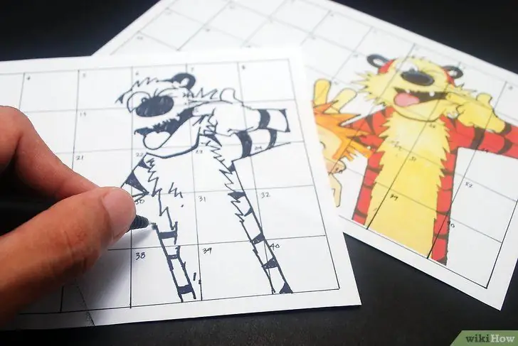
Step 8. Then draw …
Step 9. And keep drawing …
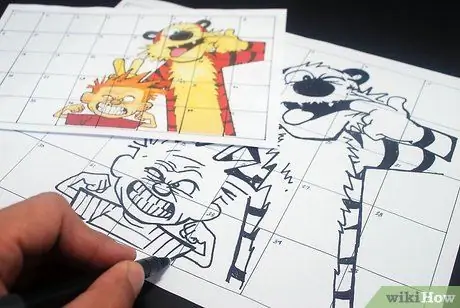
Step 10. Complete the drawing
You can do exactly how you want. For images of the same size (1: 1), you can use a magnification. However, if you are making a poster, try to make smaller squares.
For example, if you took this image and are doubling its size (2: 1), you could make 2.5 cm squares in the original image, and 5 cm squares in the enlarged poster. Or 1.27 cm squares in the original image and then have 2.5 cm squares in your poster. The important thing is to keep everything to scale
Advice
- Attention! Focus on where the lines start and end. Is it the upper left corner of the box, or the left half? If you need to make even smaller squares, do it! The smaller they are, the more detailed and accurate your reproduction will be.
- Pay particular attention to where the lines cross in the other boxes. These small differences can add up quickly, leading to a distorted version of what you are trying to achieve. This is evident in Calvin's mouth, where the designer has started to go faster.
- Take a step back from time to time to get an "overview". It's easy to get lost in small details while neglecting the most important features of a design.
- Don't avoid your ruler! Soft curves can (and should) be drawn by hand, but for straight lines like Calvin's hair or Hobbe's sides you can use the ruler.


